The text is placed inside a container with: has-container.
Some padding is added by a spacer class: py-8
Text is styled with the lead
label
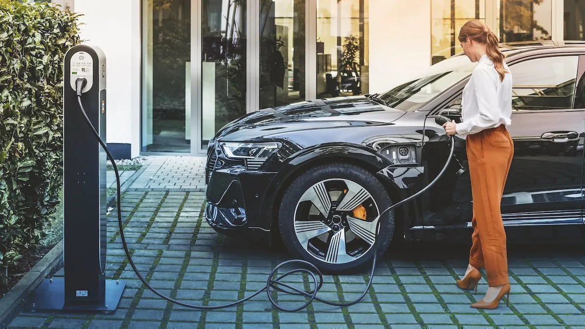
Optimise for renewables
Keywords used:
img-bottom to get the styling with text and image underneath,
container to make sure it doesn't go to the edges of the screen.
The intro text is used as the label
For an smaller image (6 columns instead of 12 columns) also use the keyword img-sm
label
Optimise for renewables
Keywords:
Img-right
Container
Extra classes added for an background color:
For background color: bg-dark (any bg-class can be used)
Rounded corners: rounded
Padding inside the element so the image isn't stuck to the top: pt-6
label
Optimise for renewables
Keywords:
Img-right
Container
Extra classes added for an background color:
For background color: bg-dark (any bg-class can be used)
Rounded corners: rounded
Padding inside the element so the image isn't stuck to the top: pt-6
Optimise for renewables
Keywords:
Img-left
Container
Keywords:
Banner
Container
For an custom background-color: has-bg-mint (or another background class)
Other:
Text inside in an blockquote element
Header image used for image on the right
Logo inside the blockquote element
For the smaller text (name company) lead (under styles) is used
Name company
Second line
Keywords:
Banner
Container
Other:
has-bg-light is used for the background color, all bg-classes can be used with has- in front of them
column-bg-dark is used for the background-color of the right column, all bg-classes can be used with the column- in front of them
Text inside in an blockquote element
Logo inside the blockquote element
For the smaller text (name company) lead (under styles) is used
Name company
Second line
Text in an smaller column
Keyword: columnwidth- and the width of the column. 12 is the full width of the container. So for example if columnwidth-8 is used the text takes 8 of the 12 columns and it is pushed 2 columns from the edge so it stay's centered.
Iconlist
shortcode: iconlist
Extra options:
&class= Sets the bootstrap column classes, when it's not used it takes the default: col-xs-12 col-sm-6 col-md-3 mb-4
&panel-class= Sets an class on the panel, can be used for changing the color by adding an bg-class
&readmore= When used sets an link-text like Read more. Only shows when card is Active.
&intro-class= Can be used to change the styling of the introduction text
&list-class= Sets an class on the outside of the element, mainly used for creating space around the whole element by adding padding classes
keywords the keywords field of the cards itself can also be used to set the color of the cards, that way you can give the individual cards an differt color
Individual access permissions enabling full control over your operations access permissions enabling full control over your operations.
learn more
Textlist
shortcode: textlist. Takes the text field instead of the intro text for the text on the cards
Extra options:
&class= Sets the bootstrap column classes, when it's not used it takes the default: col-xs-12 col-md-6 col-lg-4
&list-class= Sets an class on the outside of the element, mainly used for creating space around the whole element by adding padding classes
Residential
Feel at home with us
Our platform provides the essential building blocks for the residential ecosystem of today and tomorrow. We support every charging point, simplify the reimbursement of business electricity costs and make it possible to charge as much as possible on wind and sun, thereby saving both co2 and costs.
Tristique sed a mauris quam consectetur tincidunt. Ultricies integer duis sagittis dictum eu nibh nisi. Dui amet sed condimentum rutrum viverra sagittis ut. Amet tellus feugiat elit mattis. Ornare in vitae amet suspendisse diam velit egestas at. Lorem nisi donec euismod turpis pretium.
Lorem ipsum
Lorem ipsum dolor sit amet, consectetur adipiscing elit, sed do eiusmod tempor incididunt ut labore et dolore magna aliqua. Ut enim ad minim veniam, quis nostrud exercitation ullamco laboris nisi ut aliquip ex ea commodo consequat. Duis aute irure dolor in reprehenderit in voluptate velit esse cillum dolore eu fugiat nulla pariatur. Excepteur sint occaecat cupidatat non proident, sunt in culpa qui officia deserunt mollit anim id est laborum.
Counter
Shortcode: counter (This one takes the data from the homepage)
How it works:
The title field is used for the values, it has to be given in this format: Counter: 0:1.49: billion
Counter text to let the code know it's an counter
Start value
End value
Some text, this one is optional
All have to be split with an :
Extra options
&class= Sets the bootstrap column classes, when it's not used it takes the default: col-xs-12 col-lg-6 col-xl-3 mb-4
&list-class= Sets an class on the outside of the element, mainly used for creating space around the whole element by adding padding classes
0 million
charge points to roam immediately
0 billion
kWh provided via charging
1 years
the undisputed smart charging leader
0 billion
electric km powered
Marquee
Shortcode: gallery with subtype marquee. Theparentid is the id of the page where the gallery images are added. (this one takes the logo's from the gallery of the logo home element)
Testimonial carousel
Carousel shortcode takes the pages from the career page:
Widget: carousel
Extra options:
&pagedots= set to 1 to show pagedots
&prevnext= set to 1 to show prev/next buttons
&subtype= set the subtype of the carousel for different styling, but only testimonial is currently used on this website
&li-class= Bootstrap columns for setting the width of the carousel cards
I truly enjoy how fast-paced and dynamic both the company and the industry are; it keeps things exciting and continuously challenging. I also really appreciate the flexibility we’re given and the fact that new ideas are always welcomed and listened to—it makes a real difference in feeling empowered and engaged.
Lola
Product Manager
What I think is really cool about GreenFlux is the multicultural factor. Different people from different backgrounds coming together, and it still makes sense, it works. We have a friendly and quite relaxed atmosphere, which truly helps.
Despoina
HR Generalist
Working at GreenFlux is rewarding thanks to our dynamic and inclusive culture that encourages innovation and collaboration. The work/life balance helps us perform well while staying healthy. I'm inspired by our talented and supportive team while tackling technical challenges together in a positive environment.
Sotiris
Head of Engineering
I really enjoy the opportunity to work in a SaaS company, where adaptability and customer focus are key to everything we do. The team here is international, collaborative, and open-minded, which creates a supportive environment for sharing ideas and learning from each other.
Mélani
Business Excellence Manager
What I enjoy most about working at GreenFlux is the constant opportunity to grow, both professionally and personally. Being part of the future of eMobility and collaborating with colleagues from diverse backgrounds and with different areas of expertise makes it a rewarding place to work.
Nina
Manager Roaming Excellence
I chose to work here because GreenFlux works to make something that, for some people, can seem so surreal and so futuristic, a current reality. I continue working here because I believe in what we do and what we want to achieve. And, I know we have what it takes to do so.
Ian
Customer Success Manager
Downloads
Shortcode: document. This one takes the data from the downloads page
Extra options
The introduction field of an element is used for setting background classes, defaults to bg-gradient-primary
EV Smart Charging: Optimising with Renewable Energy
Electric vehicle smart charging optimises power distribution and leads to considerable savings for grid operators, charge point operators (CPOs), charge point owners, and EV drivers. Learn how to connect to the future with smart, real-world solutions.
In this whitepaper, you will learn:
What is smart charging?
Why use smart charging?
How does smart charging work?
What is GreenFlux's unique smart charging offer?
Eichrecht: what you need to know to operate in Germany
Are you a charge point operator (CPO) or an eMobility service provider in Germany? Learn about the German calibration law and how it may apply to your business case.
In this whitepaper, you will learn:
What is Eichrecht and when does it apply?
For what business cases does Eichrecht apply?
To whom does Eichrecht apply?
What opportunities and challenges exist in the market?
GreenFlux successfully migrated Eneco eMobility’s 3,500 charge points to its platform, thereby ensuring the operator’s future business scalability and achieving cost savings, among other benefits.
Learn how Eneco consolidated a group of legacy charging stations onto the GreenFlux platform while maintaining business continuity and gaining:
improved data communications security
more efficient asset management
price transparency compliance
business and operational scalability
additional savings
Case studies
Shortcode: caselist. This one takes the data from the case studies page
Background an text classes give the same color as the buttons.
Background classes are used to give an element an background color.
Text classes are used to give text an color.
Background Classes (bg-)
bg-primary
bg-dark
bg-secondary
bg-medium
bg-success
bg-success-light
bg-success-soft
bg-success-dark
bg-light
bg-lighter
bg-light-grey
bg-mint
bg-info
bg-white
Extra backgrounds, used in the downloads page
bg-gradient-primary
bg-gradient-success
bg-gradient-light
Text Classes (text-)
text-primary
text-dark
text-secondary
text-medium
text-success
text-success-light
text-success-soft
text-success-dark
text-light
text-lighter
text-light-grey
text-mint
text-info
text-white
Margin and padding
Margin: Creates space outside the element’s border, pushing it away from surrounding elements. Use classes like m-2 for a general margin or mt-2 for specific top margin. Margin does not affect the element’s actual size, just the distance around it.
Padding: Adds space inside the element’s border, between the content and the border. Use classes like p-2 for padding on all sides or pt-2 for specific top padding. Padding increases the total size of the element as it grows the space around the content within the element.


